Case Study
The nine year old could not log in without his mother
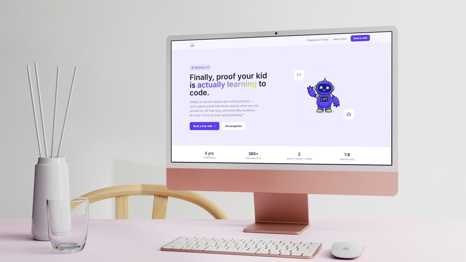
A kids coding academy thought it needed streaks and badges to compete. The actual reason kids stopped practising was that their account lived behind a parent’s email and password.
The situation
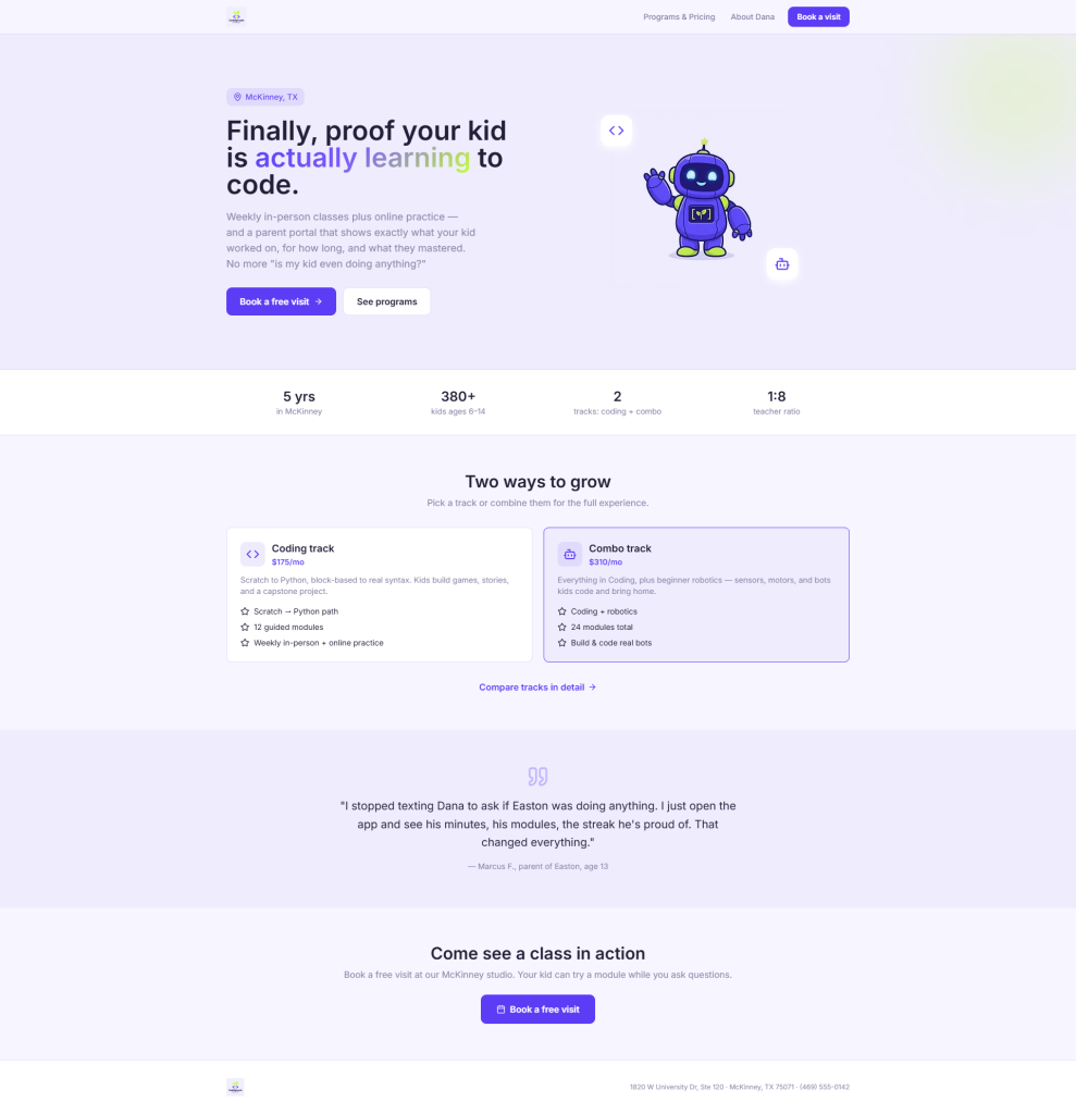
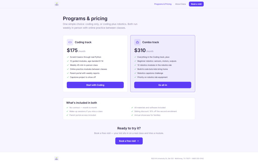
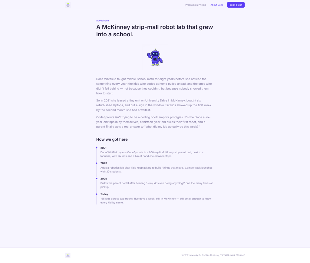
CodeSprouts Academy teaches coding and beginner robotics to 165 kids aged six to fourteen, out of a strip mall in McKinney, Texas. Weekly class in person, practice modules online during the week. Around 29 to 30 thousand dollars a month across a 175 dollar single track and a 310 dollar combo with robotics. Dana owns it, Marisol works part time.
The online half runs on a LearnDash site her nephew built four years ago for about 400 dollars and a promise of tacos. He has a job at a bank now and answers texts in four days. Reporting is class level, not per kid, so every other Sunday Marisol exports a spreadsheet, builds progress graphics in Canva by hand, and texts them to parents one at a time.
The real problem
Dana was certain the fix was gamification. She keeps a competitor’s kid app open in a private tab at 11pm, the one with the streak flame and the level up animation, and she said the badges were probably eighty percent of it.
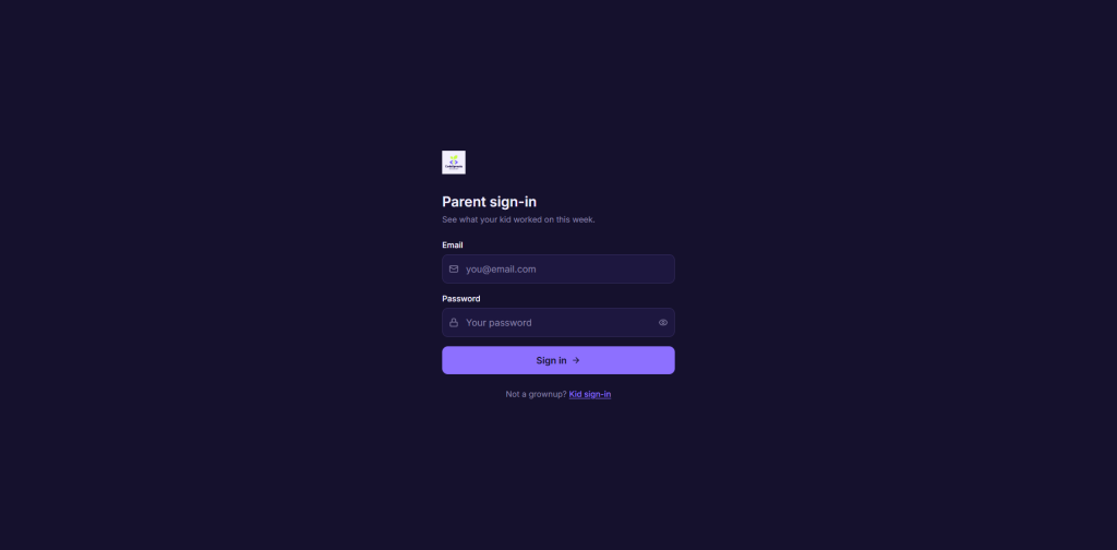
The load bearing problem is one sentence in her own email, and she walked straight past it. The login lives under the parent’s email, so a kid cannot get back into his own account without mum sitting down to do it. Mum is busy every week. So the kid stops. Completion on the online levels is about a third and nobody finds out until the child has already drifted out of the programme.
The second half is on the parent side, and a mother said it out loud at pickup, not even angry, just tired. She was paying 175 a month and genuinely did not know if her daughter was doing anything. There was no screen anywhere that could have answered her. Only Marisol’s Sunday night Canva graphics, arriving every two weeks, for 165 kids.
Badges on top of a locked door do not open the door.
What we designed
Two interfaces that share a brand and behave nothing alike.
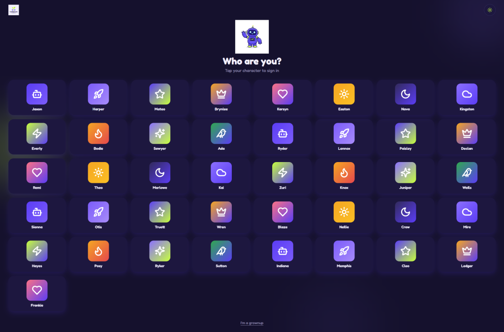
Kid mode signs in with a picture password. Tap your avatar off a photo grid, then tap three pictures in the right order. No keyboard at any point, because a seven year old on a shared classroom iPad should not need to type an email address. That single screen is the whole project. Everything else is built on top of it.
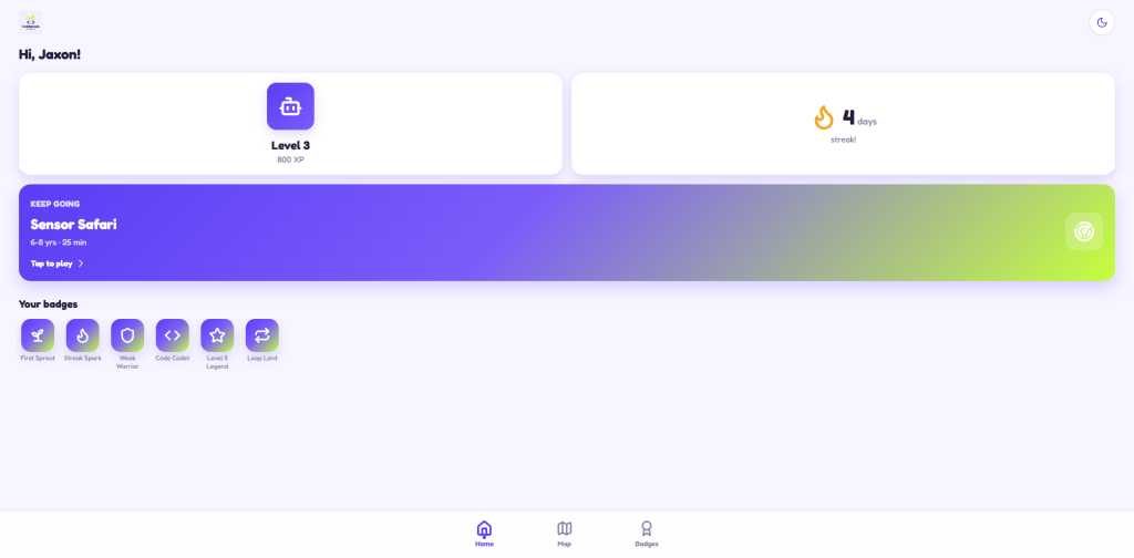
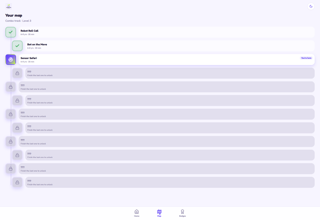
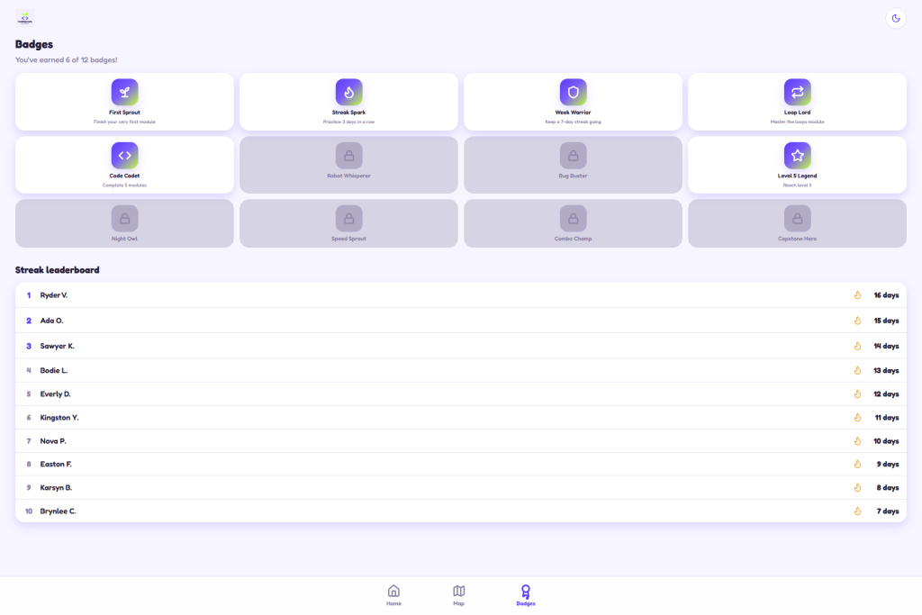
Past the door, kid mode is what Dana actually asked for, a big avatar card with the current level, a streak counter, and one oversized continue tile for the next module. Plus a level up celebration designed as a real moment rather than a toast notification. She was right that this matters. She was wrong about the order.
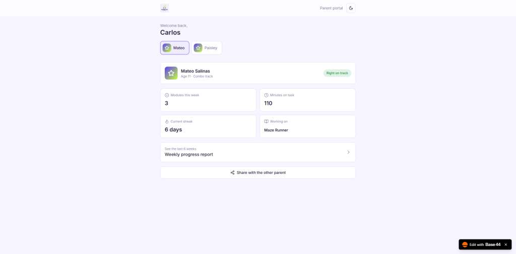
Parent mode is the opposite personality. Calm, flat, scannable in about eight seconds on a phone in a school pickup line. Modules done this week, time on task, current streak, what the child is working on now, and one honest on track or drifting signal. A child switcher for households with more than one kid. This is the screen that replaces Marisol’s Sunday.
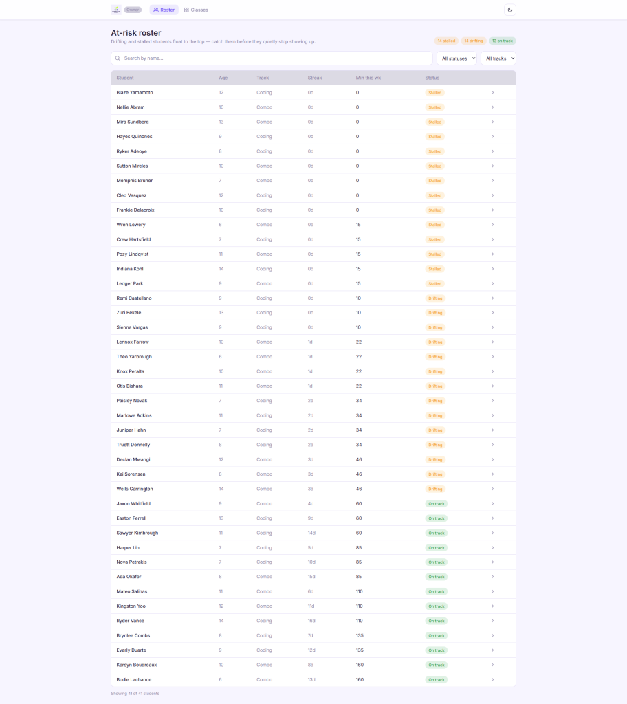
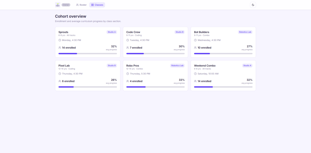
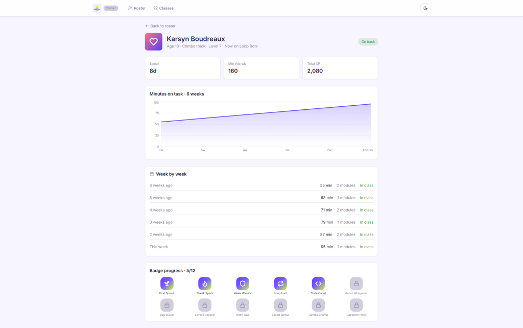
Dana gets an owner view that surfaces the kids going quiet, because the ones she loses are never the ones who complain.
Design decisions
Two modes, one brand, no blending. Electric indigo with a lime accent, Fredoka for kid mode and Inter for parent and owner. Most family products pick one tone and split the difference, which produces something too babyish for a parent to trust and too flat for a child to open. These are designed as two personalities that happen to share a colour.
The picture password is the hero screen, not the dashboard. Portfolio work usually leads with the prettiest screen. Here the most important one is a login, because that is where the business is actually leaking.
Built for a cracked five year old iPad. Minimum 64 pixel tap targets in kid mode and nothing that depends on hover. The classroom hardware is what it is, and a design that only works on the newest device is a design that does not work.
The gradient goes indigo to lime, never indigo to blue. A kids brand can carry a saturated gradient. It just cannot be the same purple to blue every SaaS dashboard has been wearing for five years. Parent surfaces stay flat entirely.
A night owl dark mode for the kid side. Cozy rather than a dimmed version of the parent theme, because the kids using it after dinner are not doing admin.
Results
Framed as what the design is built to move, from her own numbers.
Roughly half of last September’s kids were still enrolled by June, and Dana wants 55 percent re-enrolment by January. Kid level sign in is aimed directly at the drift, since a child who can open his own account on a Tuesday is a child still in the programme in May. Completion on the online levels sits near a third. The parent dashboard answers the is my kid doing anything question before it becomes a text message, and Marisol’s every other Sunday goes back to being a Sunday.
Six weeks is the timeline and January is the open house, so the honest read on re-enrolment comes after that cohort.
What I would do next
Inactivity nudges that fire per child rather than per list, since the last attempt at that spammed the kids who were doing fine. Then instructor tablet views for in class check in, so the shop floor and the online record stop being separate stories.