Case Study
Four tools became one, and students stopped asking where things were
A Spanish school for adults was losing people to confusion, not to price or teaching. We replaced a four platform stack with a single dashboard where the self paced course and the live class finally share one spine.
The situation
Puente Language Studio teaches Spanish to adults in Tucson, mostly people who married into a Spanish speaking family or travel for work. Six and a half years in, 340 active students, around 28,000 dollars a month across a self paced membership and eight week live cohorts. The teaching was never the problem. People rave about the live conversation classes.
The setup underneath was four separate products held together by automations. Course library on Teachable, live classes booked in Calendly and delivered in Zoom, community on Mighty Networks, and Zapier passing messages between all of it. Roughly once a month a zap quietly stopped running and nobody found out until a student emailed asking why she never got her Zoom link.
The real problem
She came to us thinking she needed a nicer site and a better onboarding video. She was already half right about what was actually wrong, she just said it at the very end of a long email instead of the beginning.
Only 110 of 500 people finished the beginner track last year. That is not a design problem. Students could not tell whether unit 4 conversation practice on the calendar was the same thing as module 4 in the course library, because nobody had ever made those two names match. There was no single place that knew where a student was. One of them wrote in and said she had paid for two months and still could not find where she left off and felt like she was wasting her money. She was not wrong, and that is the sentence the whole project got built around.
The other quiet one: the support address forwarded to a personal inbox. A student emailed it, got nothing back, and asked if the school was even still running.
What we built
One login, one dashboard, one program spine.
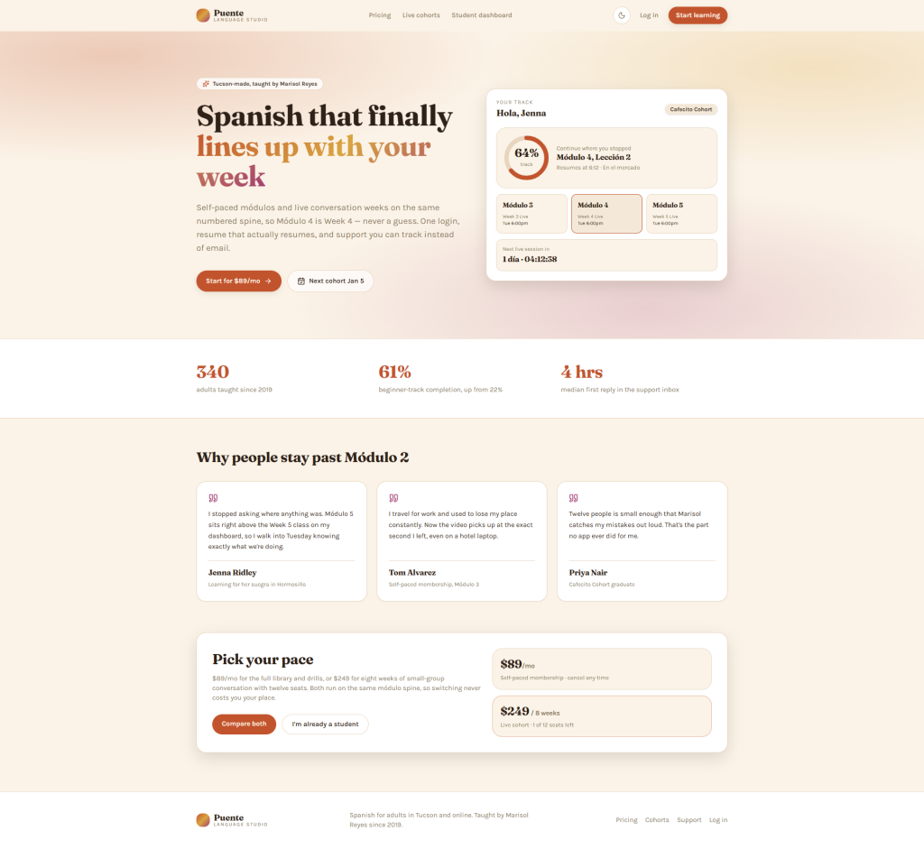
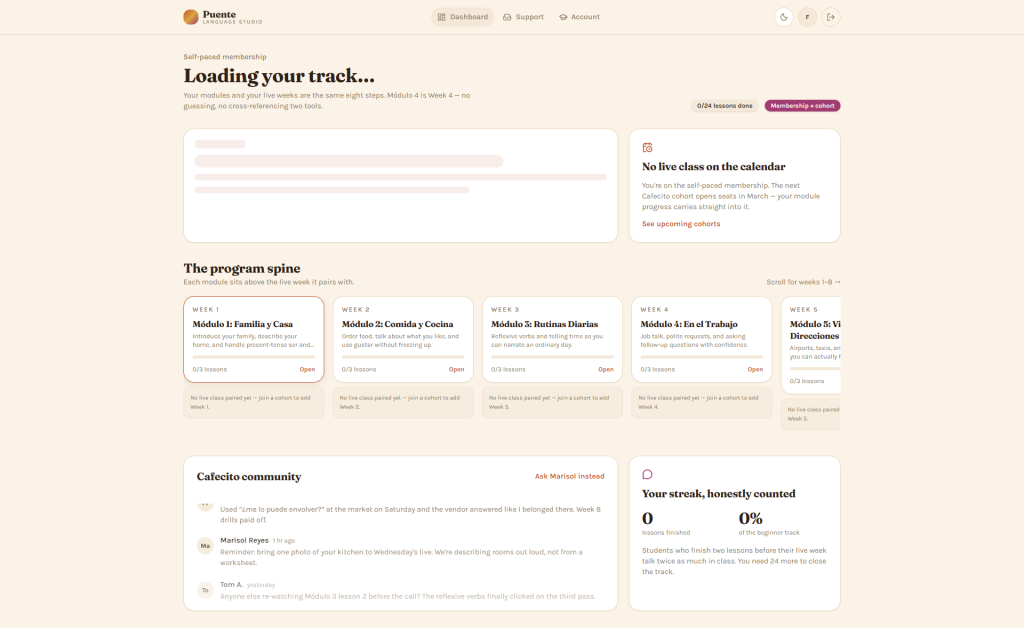
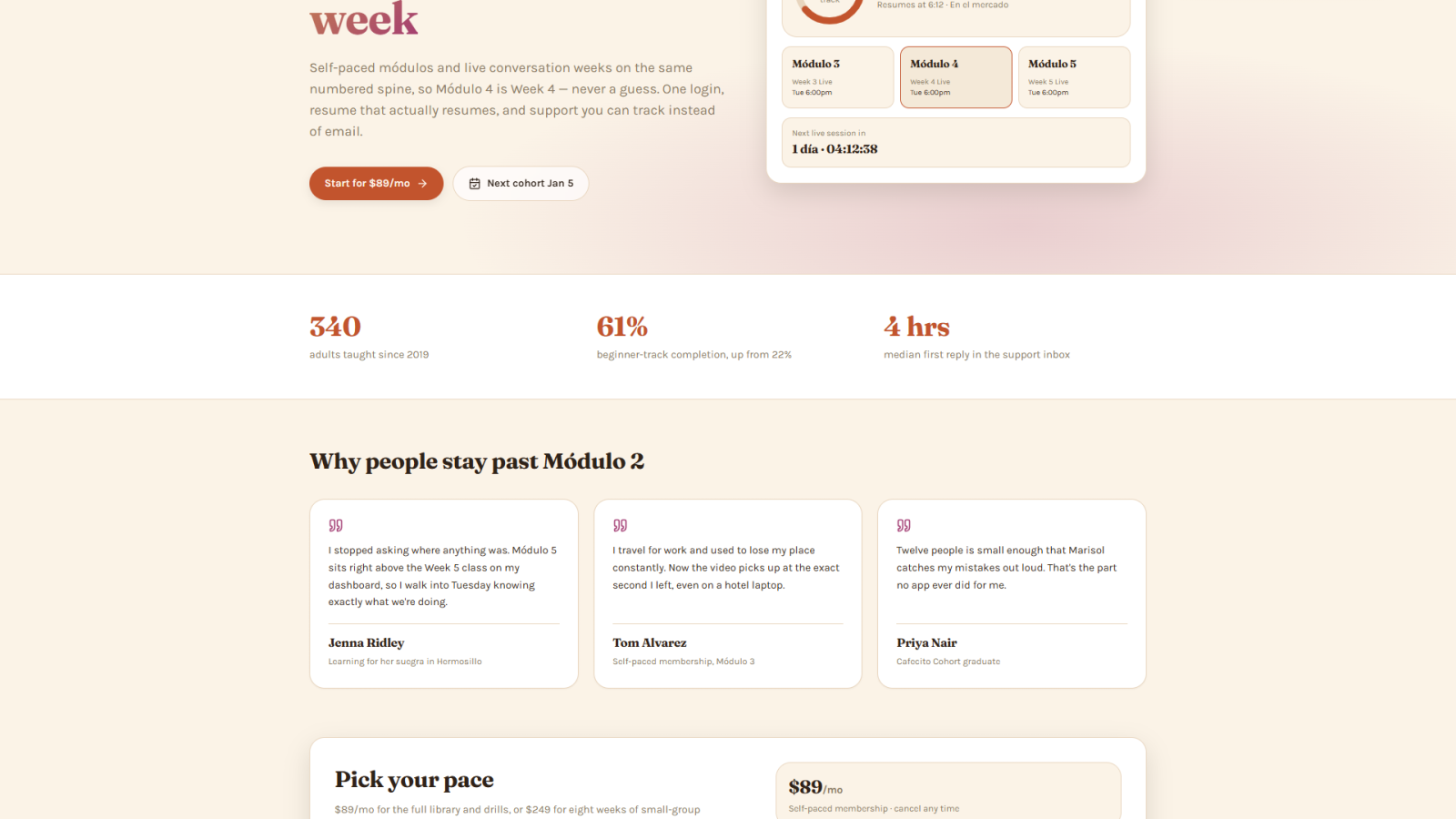
The dashboard opens on the next thing you are supposed to do, not a grid of courses. A student sees the lesson they were halfway through, the date and time of their next live class, and how far into the eight weeks they are. Self paced modules and live cohort weeks are the same numbered unit in the interface, so week 4 and module 4 are visibly one thing instead of two systems using different words.
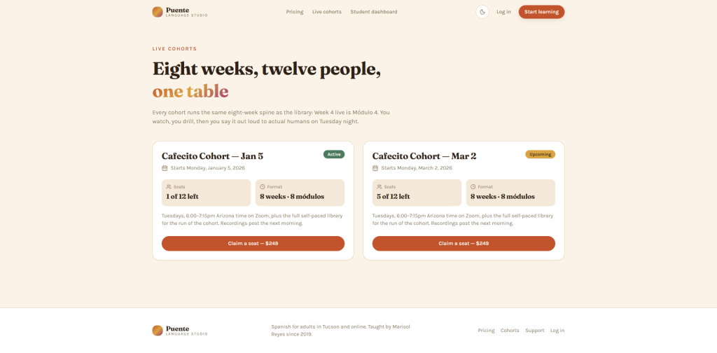
The lesson player saves progress continuously and resumes on any device, because half this audience practices on a phone and signs up on a laptop. Support became a real ticketed inbox with visible status, so nothing lands in a personal email and disappears. Cohorts have seats, start dates and a waitlist, so enrollment stops being a Calendly link taped to a course.
Design decisions
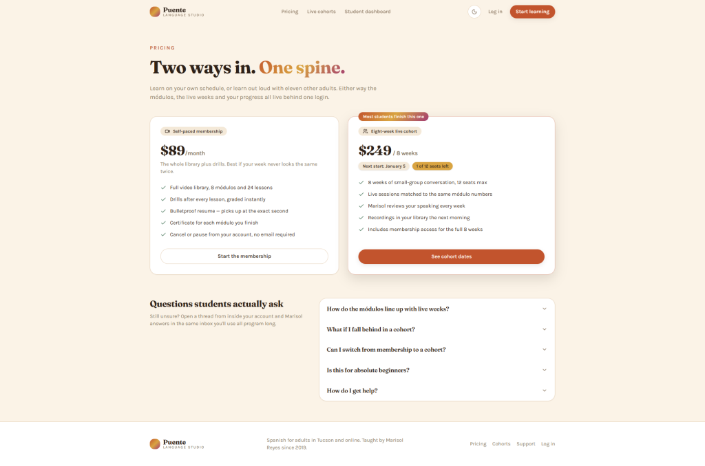
Warm terracotta and marigold, not startup blue. This is an emotional purchase. People buy it to talk to their mother in law or to their coworkers in Mexico City. The palette runs terracotta, marigold and a berry magenta accent on a cream paper background, culturally rooted and warm without tipping into cliche. Fraunces for headings gives it a human, slightly editorial voice. Karla keeps the interface plain and readable.
The dashboard opens on resume, not on a catalogue. A course grid is a decision. A returning student does not want a decision, she wants the next four minutes of her life handed to her. Resume first is the single change most likely to move that 22 percent.
One numbering system, enforced in the data model. This looks like a small copy fix and it is actually the core of the build. Modules and live sessions belong to one program spine in the database, so they cannot drift apart again the way they did across four tools.
A dark mode that is genuinely designed. Cocoa brown rather than inverted grey. This audience practices late, after the kids are down, and a warm dark theme reads better at eleven at night than a cold one.
We said no to the app. She asked for something like Duolingo for practicing in the checkout line, and believed that was the fix for completion. It is not, and it does not fit nine thousand dollars or a January deadline. She gets a mobile practice surface on responsive web instead, and the app stays on a roadmap where it belongs.
Results
The where do I find question arrives about nine times a week. Every one of those is a student who could not locate their own progress, and the dashboard answers all of them before they are asked. Beginner track completion sits at 22 percent, and resume first plus visible due dates plus one naming system is aimed squarely at the structural half of that gap. Subscription churn runs 9 percent a month, and a meaningful share of that is people who drifted rather than people who decided. She also stops paying around 343 dollars a month for four subscriptions plus a legacy plugin she was scared to cancel because she no longer knew what it did.
Ninety days is the honest window for the completion number, because the beginner track takes that long to finish.